- PagerDuty /
- Blog /
- Announcements /
- It's a Match! Swipe Incidents with PagerDuty Mobile App Update
Blog
It's a Match! Swipe Incidents with PagerDuty Mobile App Update
Mobile 4.0 Release Includes Cool New Features Like Swiping to Ack and Cleaner Design
Since our first release in early 2013, the PagerDuty iOS and Android apps have been a key part of how we provide powerful incident management capabilities to all of our customers, wherever they are.
Almost 50,000 people use our mobile apps every month, and this year, push notifications overtook email as our most-used alerting method: over 2.5 million push alerts monthly.
Now, we’re pleased to announce our fourth major mobile release, which brings some significant improvements and updates to the performance and usability of key parts of the app.
What’s Changed?
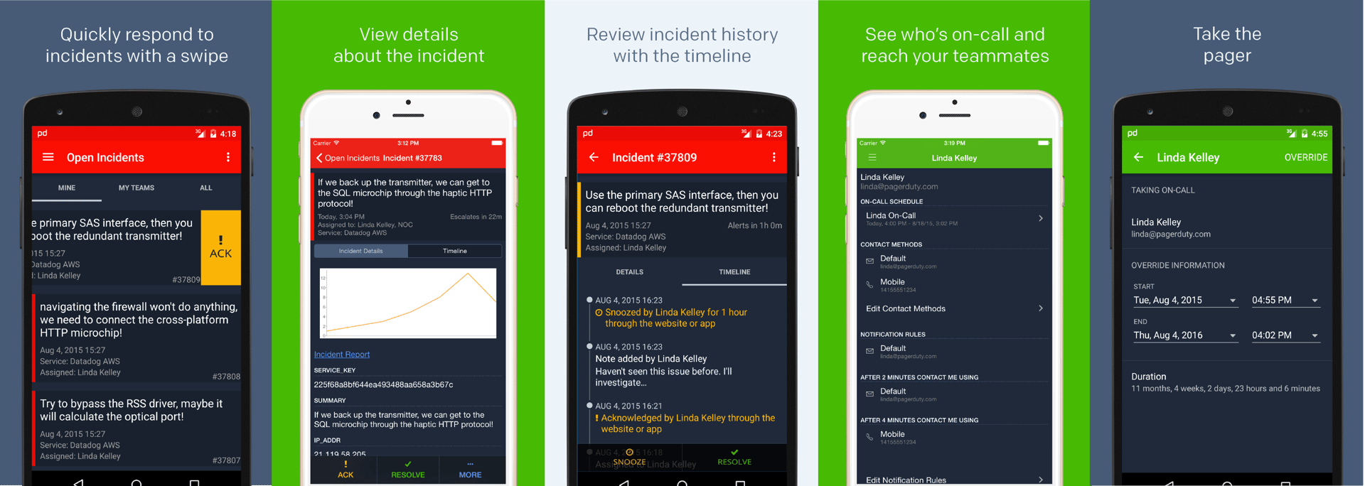
On the incidents list, new swipe gestures improve usability, reduce accidental actions, and help you see more of the details you care about. And when you tap into an incident, the details are front-and-center, helping you see exactly what’s wrong at a glance, and floating action buttons stay accessible no matter where on the screen you are.
In addition, throughout the app, we’ve updated padding, typography, and colors for better readability, as well as implemented layout and UI patterns more in line with iOS and Android design standards.

With all these changes, it’s faster and easier than ever to see, investigate, and take action on problems in your system — driving down resolution time and helping your team improve your operations performance. We hope you enjoy it — you’ll find it on the iOS and Google Play app stores.
Our mobile app is a constantly evolving product, and your feedback helps us make it better. Want to help? Join our Mobile Beta program and get the newest stuff before everyone else!


